Responsive Website - Restaurant Chorge Misal
Designing a website for an eating establishment Chorage Misal that serves authentic Kolhapuri food.
Chorage Misal is a family-owned restaurant serving one of the most popular dishes from the Maharashtrian cuisine. The current owner Mr. Abhimanyu Chorge and Mrs. Gauri Chorge has taken over their family business. Mr. Abhimanyu Chorge’s Grandfather is the founder of the Chorge Misal established since 1959.

Introduction
An Overview
Duration
4 weeks
Role
UX UI Designer
Tools
Figma, Whimsical, Adobe Photoshop
The Problem
The restaurant is well established within Kolhapur, India, nevertheless with the digital world it has been imperative to make a place on the web for travelers, explorers and foodies.
The Solution
Building a website, where people can be aware of the brand and will be able to order and pick up or/and get a free delivery service. People want to save their time traveling to eat in crowded places, so they choose to order online. By providing them fast home delivery service will make the customers go to Chorge Misal website and it will help to grow the customers and business.

01. EMPATHIZE
MARKET RESEARCH
STRENGTHS
There is a logo with the name
There are links to social media
For contact there is link to WhatsApp number
There are reviews
WEAKNESSES
The landing page is just an advertisement of a past event
Menu isn’t displayed
There is just one image of the product
STRENGTHS
Contact number is right in the logo
Menu is displayed on the landing page
There is address in the footer however the get directions icon takes you google maps
Gallery has images as well as promotional videos
WEAKNESSES
There is no UI for the website
There is no online ordering on their website
There is a button “Get Quote” however the objective of the same isn't clear
“Read more” takes you to the google page.
There is no info “About us” apart from just one sentence present on the website.
Gallery just show the product images without a description.
STRENGTHS
Landing page has an image with the entrance of the restaurant
Testimonials are present
Gallery has appetizing images
WEAKNESSES
There is no UI for the website
There is no online ordering
There is a button “Get Quote” however the objective isn't clear
No menu present in the website
No logo for the site
Gallery just show the images without a description.
STRENGTHS
Landing page has an image with the entrance of the restaurant
Menu is present
Gallery has inviting images of the beverages
WEAKNESSES
There is no UI for the website
There is online ordering button but is not functional
Find table button is not functional
Button to view menu is not functional
Logo for the business is seen in the gallery
Gallery just shows the images without a description.
“Read more” takes you to the google page.
STRENGTHS
Gallery has few images of food
The footer has contact info, address and hours present
WEAKNESSES
There is no UI for the website
There is no online ordering
The landing page image is misleading
No menu is present
No logo is present
Gallery just shows the images without a description.
No About us info present
Summary Findings
In the restaurant industry, it’s no doubt that there’s a lot of competition and this makes it crucial to analyze what direct and indirect competitors are doing to stand out.
Taking in to account about the location; awareness and usage of technology; having a website for fast food restaurants is not given much of importance. However, considering the digital age and the necessity of having a space in the world wide web is of extreme importance.
For direct competitors, I focused on other restaurants that serve Misal Pav in the same area.
With indirect competitors, I looked for restaurants within the same location serving different kind of foods.
There are numerous Misal restaurants in Kolhapur but rarely have a website. What they all have in common is the mission to maintain the authentic taste of Misal and they try to capture customers using a tagline, photos of food and their restaurant.
Most are just listed on google and option to order via Swiggy and Zomato. These are Indian online food ordering and delivery platform. Some have Facebook pages with info and few restaurants are listed under blogs written by foodies on their personal page.
Overall, analyzing the competition puts things into perspective for Chorge Misal website and helps to formulate all necessary elements for effective User experience.
USER INTERVIEWS
I categorized the participants in to categories. It helped me understand the needs from different prospective. Knowing and gathering in depth understanding of helped me with my research.
Firstly interviewed the Owner to get an insight for what she wants to improvise the website. She is the one with interacting with the customers having direct connection of the user needs and collecting primary information.
Then I interviewed the locals next as they are the one who are going to use the website. Learnt about the most important features to incorporate in the websites, pain points about any website, and what features motivates them to go for the online ordering.
Lastly I interviewed the frequent travelers as they would have a different prospective towards the requirement to view the website.
Research Objectives
Understanding what people look for in a website
Determine the features that are important
Know the comfort and ease of navigation
Understand the expectations from the website
AFFINITY MAPPING
Goals
All participants check websites before going to new restaurants.
All participants focus on pictures and reviews that help them decide to pick a restaurant.
Needs
3/4 participants rely on restaurant reviews
2/4 participants check the price and portion of food restaurants offer
2/4 participants check location and hours of the restaurant
1/4 participants check if there are any offers, specials or deals the restaurant is offering
1/4 participants look for promotional video's of the food the restaurant offers
1/4 participants checks what is the unique feature of their cuisine/restaurant
Motivation
2/4 participants feel it is convenient to eat out due to lack of time to cook and eat
2/4 participants enjoy food as they like to try different cuisines and explore restaurants
Frustration
1/4 participants are irritated that need to to call to order and can’t do it online
1/4 participants are not willing to pay for the delivery service
1/4 participants are disappointed as there are no updates on the menu
1/4 participants feels there needs to be localization of websites
RESEARCH FINDINGS

After Market Research, Competitive Analysis, User Interviews and Surveys the following elements need to be imperative in the website.
Address, Phone Number, & Hours
Link Directly to social media
Spotlight on the Menu
Online Ordering
Offer Gift Cards and Merchandise – deals
Highlight Loyalty
Encourage Email Sign-Up
Include Enticing Photos
Tell Your Story - This is a great way for people to learn more about the restaurant concept and what your business represents.
02.DEFINE
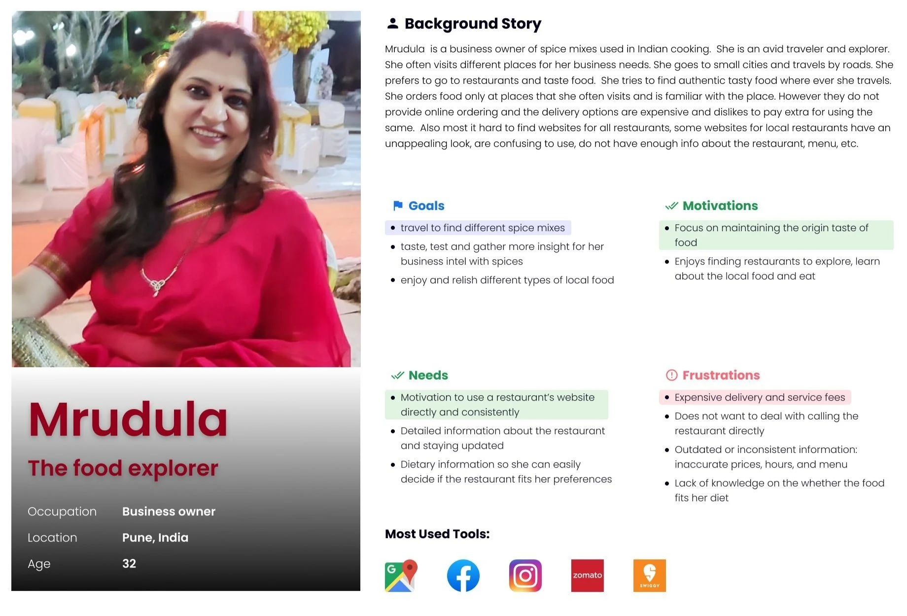
USER PERSONA
Personas make a quick, empathic way for our users’ context, motivations, needs, and approaches to using the product. They are meant to help us focus on what matters most to our users and put ourselves in their shoes when making design decisions.
PROJECT GOALS
After understanding the needs and pain points of the users, and after reviewing competitive analysis, I categorized my project goals into the following:
User Goals
Online ordering function
Restaurant's hours
Contact number
Location
Business Goals
Increasing sales
Expand business
Raising brand awareness
Technical Goals
Improve search engine rankings
Increase Overall Website Traffic
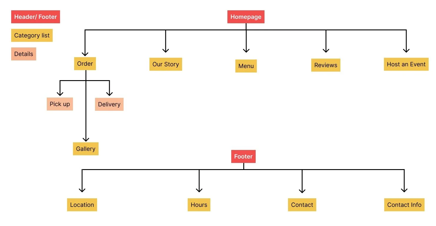
SITEMAP
Based on research and surveys I built the sitemap, however as I designed the site and received inputs from the owner, I revised certain links and pages in the website.
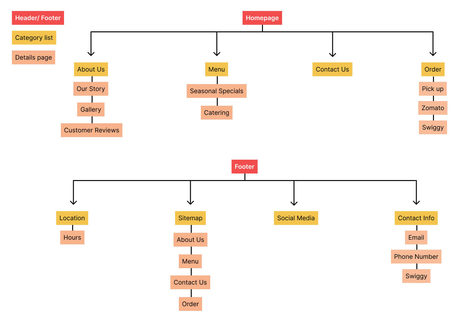
As I designed the site and received inputs from the owner, I revised certain links and pages in the website.
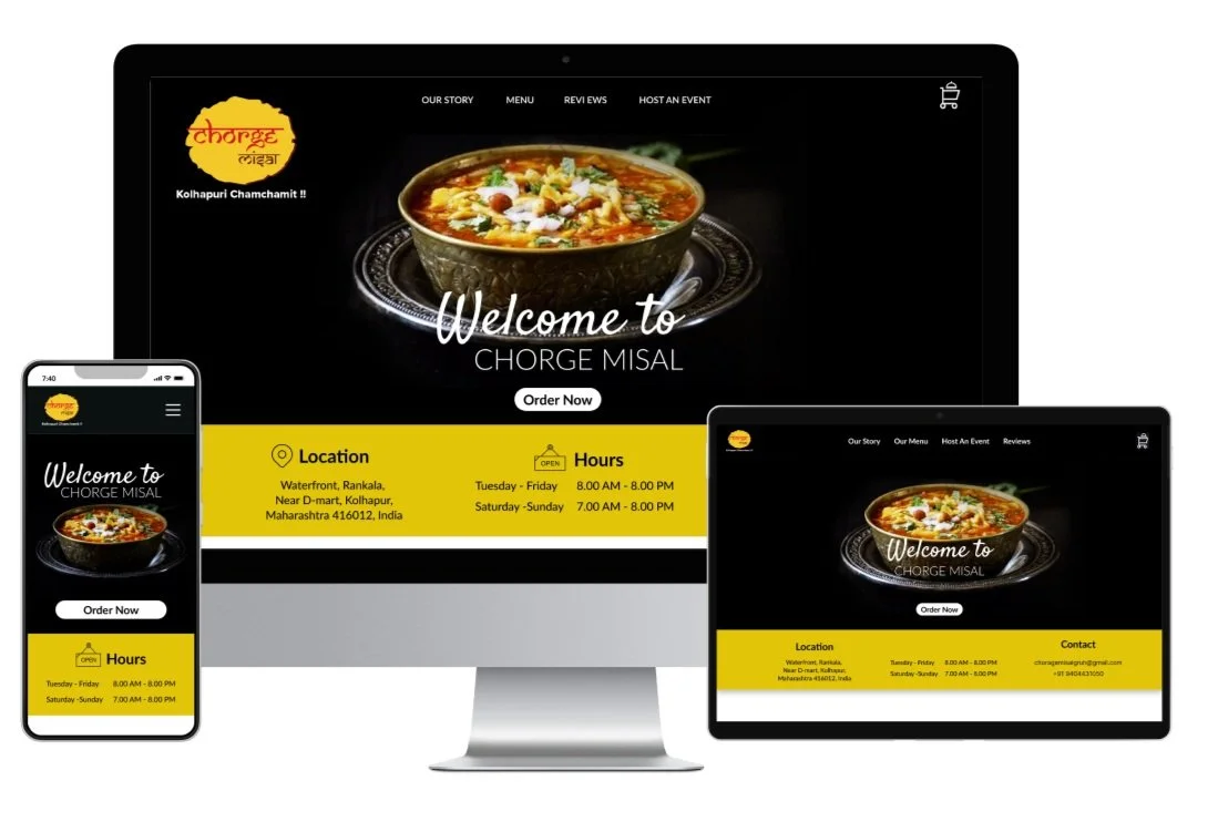
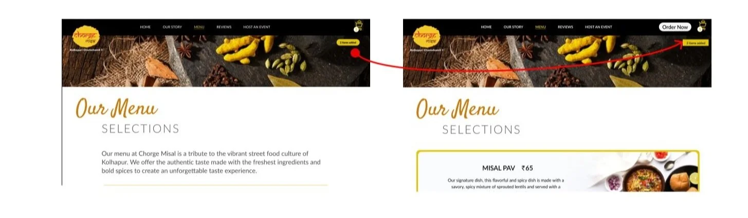
Homepage - Order now is a primary button and needed to be on the homepage and the main navigation. Also users need to see the Gallery on the homepage.
Our Story - Being a family owned restaurant the owner wanted a personal touch the page as some customers look for a authenticity and history of the place.
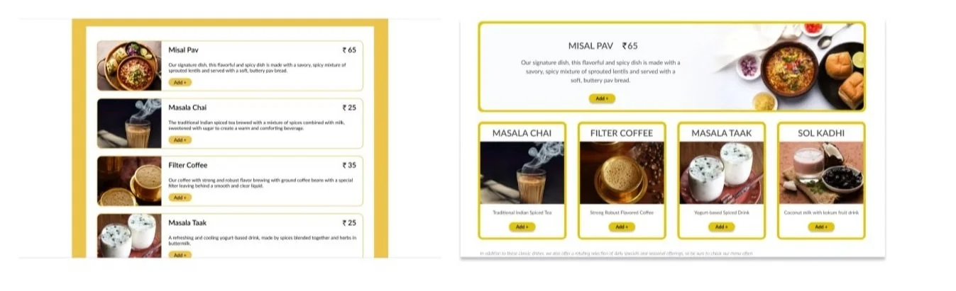
Menu - Since there is only one signature dish, and there might be change in the seasonal beverages just having the menu laid was preferred by the owner.
Reviews - Considering the importance of customers reading reviews I made a different page for the same.
Host and Event - Since there is contact info on the homepage, Hosting an Event with a live counter of Misal Pav is their USP and needed to have a separate page.
Footer - Having links to Social Platforms was the highlight that was expected by the owner.
WIREFRAMES
A wireframe is a layout content and functionality on a page which takes into account user needs and user journeys. Wireframes establish the basic structure of a page before visual design and content is added.
Main menu navigation I added following buttons.
Added Host an event in the menu as page. As research finding, the owner said it is their USP
Added Reviews as the items on the menu are limited and people would want to just read the reviews. It came up to be an imperative point to choose restaurant based on reviews
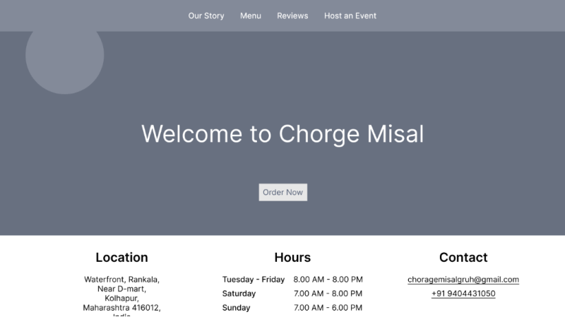
For the homepage I added the following info to be viewed at one glance
Location
Hours
Contact info
Links to Our Story, Menu & Reviews
Separate section of Gallery
03.IDEATE
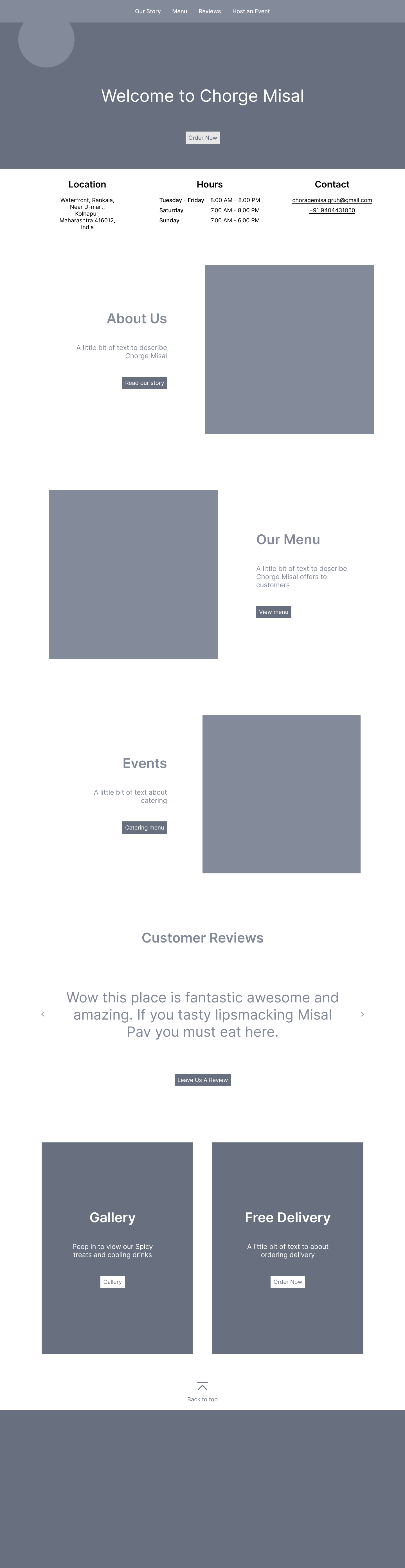
Scenario - Mrudula successfully orders food for pick up.
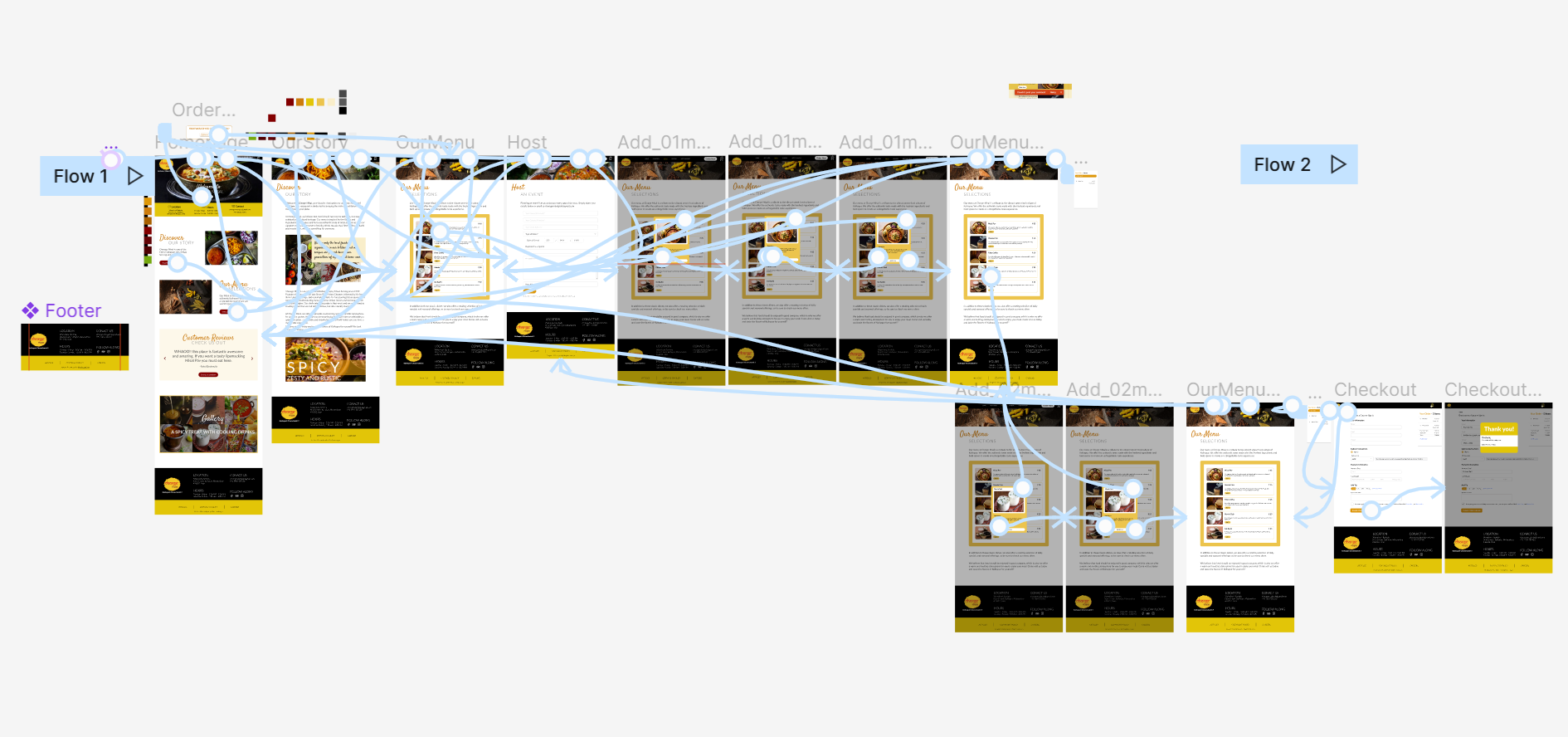
TASK FLOW
USER FLOW
User flow is the road map to the user to guide through the path in the website. She has chosen to order and pick up food at the restaurant.
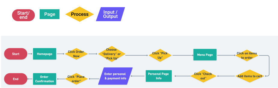
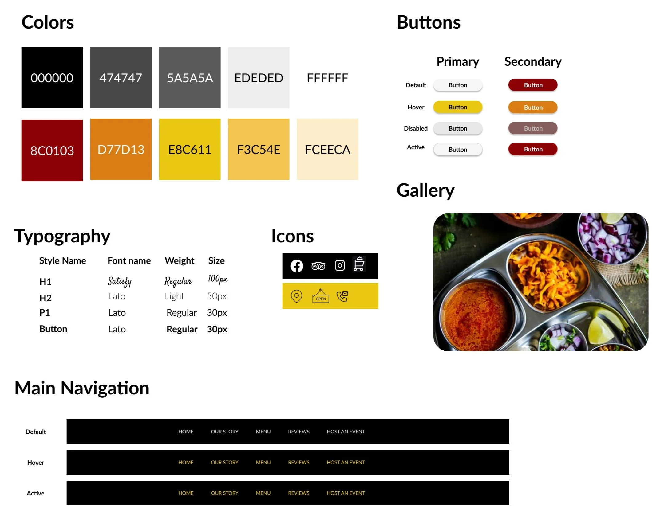
HI-FI DESIGN
Content and visuals work together to make high fidelity assets. This creates a design as close to the final product.
UI KIT
Based on review and iterations reorganized all the elements in the website.
04. PROTOTYPE
A sample version of a final product was made before launch. The goal of a prototype is to test and validate ideas before sharing them with stakeholders and eventually passing the final designs to engineering teams for the development process.
Prototype
05. TEST
USER TESTING
I invited 5 participants to offer qualitative feedback on iterating the design of the product.

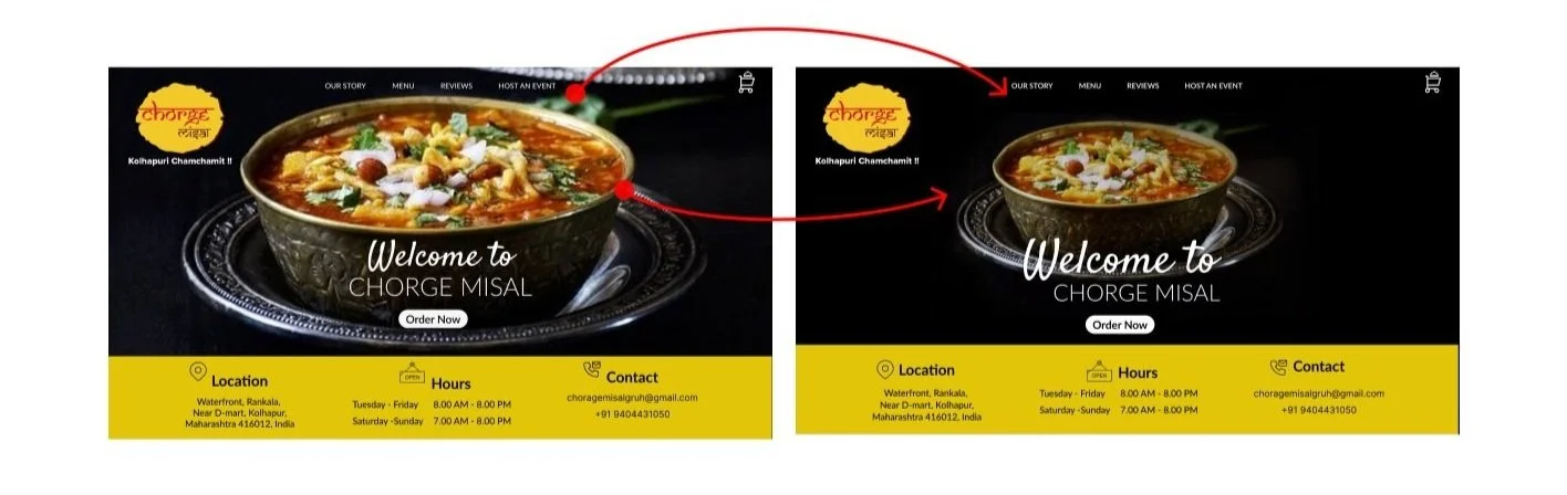
The hero image appears too gaudy and loud
The main navigation font appears weak
The “Order now” button is missing on the menu page header
The menu page shouldn’t have a long scroll when there is limited menu
Toaster is confusing, appears like a button
The checkout page - no scroll as to complete a financial transaction.
AFFINITY MAPPING
Affinity mapping is been used to organize and prioritize test findings in to success, pain points, improvisations and suggestions.
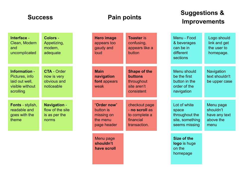
PRIORITY REVISIONS
After conducting the usability testing and collecting feedback from my users, I went back into Figma to start prioritizing screens to reiterate.
Hero image appears too gaudy and loud
Main navigation font appears weak
“Order now” button is missing on the menu page header
Menu page shouldn’t have any text above the menu

Menu page shouldn’t have scroll to view the menu. Since the menu is small should be visible in one glance
Menu - Food & beverages can be in different sections
Toaster is confusing, appears like a button
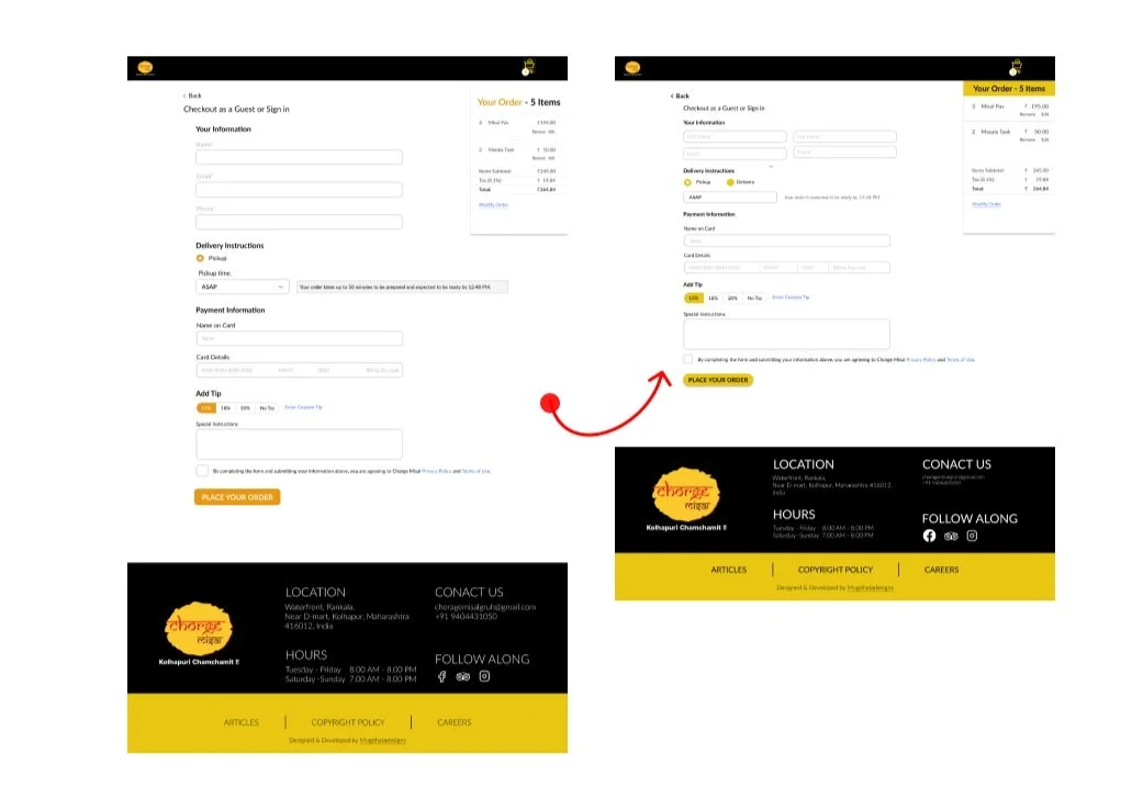
Checkout page - there shouldn't be a long scroll as to complete a financial transaction

Next Steps
The goal of this project was to redesign and create a responsive website that allowed Chorge Misal customers to order online at ease. This project gave me the opportunity to learn so much more about the restaurant industry by researching competitor websites and listening to various perspectives from consumers.
Did I solve the problem?
Well I like to think so, I had a 100% completion rate and quotes from usability participants like...
“THE INTERFACE IS VERY MODERN AND UNCOMPLICATED”
“THE UTMOST IMPORTANT INFORMATION OF LOCATION, HOURS AND CONTACT IS CLEAR RIGHT ON THE HOMEPAGE“
“THE PAGE TITTLES ON THE OUR STORY PAGE - THE CURSIVE WRITING HIGHLOIGHTS THE FOOD AND THE OTHER FONT IS CLEAR FOR THE INFO“
“THE TITLES ARE VERY PLEASING… DISCOVER OUR STORY, OUR MENU SELECTION… SEEMS VERY INVITING”
What I learned
Throughout this process, I learned a lot about user research strategies and how to take insights and implement them into sound design decisions. I learned the importance of user testing and how valuable those sessions can be to the final product.
What I would do differently
Next time I will...
- spend more time making detailed wireframes before doing the hi-fi designs
- design as many icons possible for greater visual impact
- show my designs often and get feedback
- use different Figma features for designing