
UX/UI Case Study
Adding scheduled messages to WhatsApp
WhatsApp has quickly emerged as the go-to messaging app for over 1.6 billion consumers around the globe. The user base spans a wide range of demographics, including age, education, tech-savviness, and economic divides.
WhatsApp is a fast, simple, and convenient way for family and friends to send text messages, voice messages, make voice and video calls, and share images, videos, documents, location, and contacts and engage in private, secure conversations anytime, day or night.
Project Overview
THE PROBLEM
Users don't always receive messages at a time that makes the most sense to respond. Allowing users to schedule messages reduces the likelihood that they forget to respond, but also allows them to control when the message is received.
THE SOLUTION
You could type the message, schedule it to be sent out at a certain time and date and then the platform sends them as scheduled.
Busy users could use this feature to schedule birthday and anniversary messages to be sent at the appropriate times. It can also be used as reminders to inform that the message will be sent, option to have this feature turn on and off.

EMPATHIZE
MARKET RESEARCH
Analyzing competitors allowed me to discover what was missing in the current market, design patterns that were successful, and areas of opportunity.
Reminderbase
Strengths
Has multiple notifications and reminders
Can Imports appointments from calendar
easy to use
nice intuitive interface
clear pricing info
Can send appointments to emails via phone text.
Weakness
Need to signup (email)
Needs to be subscribed
Apple based app
Needs local U.S. phone numbers to send text messages with an upgraded plan
limit to text messages
App is very slow running and takes forever to load
new phone number to schedule text messages

Kyew
Strengths
straightforward UI
uses your phone number to send messages
Weakness
Apple based app
Free App to use, but some functionality requires a subscription
it locks up when you are scrolling up and down,
Doesn't always send text as mentioned time

Scheduled
Strengths
Auto Send messages
Schedule unlimited reminders
Import appointments from calendars
simple and straightforward to use
Clean and intuitive design
interface is clean and modern
Weakness
Can schedule 3 reminders in free version
Unlimited Reminders cost money

Signal
Strengths
Fast to chat
Free to use
Can make calls as well
Weakness
Occasional problems with sending and receiving messages
Slow loading

Facebook Messenger
Strengths
Fast to chat
Free to use
Can make calls as well
Weakness
Doesn’t completely protect privacy
quickly drain the battery of your device.
It takes up a lot of space.
COMPETITIVE RESEARCH
Competitive analysis helped me identify competitors’ strengths and weaknesses in relation with Whatsapp as a product, and its design. This insight helped me design better and effective feature.
Summary
Most Apps have similar features but each has some differences in terms of usage and accessibility
Most apps are free for a limited period of time
There is limit for free messages within that time frame
All apps have a nice, and intuitive interface
Only few apps are fast to use
Most apps need subscription to use the service
Few apps can import appointments from calendar
Some apps need phone number to use service and/or need emails
Not all apps support iOS and Android operating systems
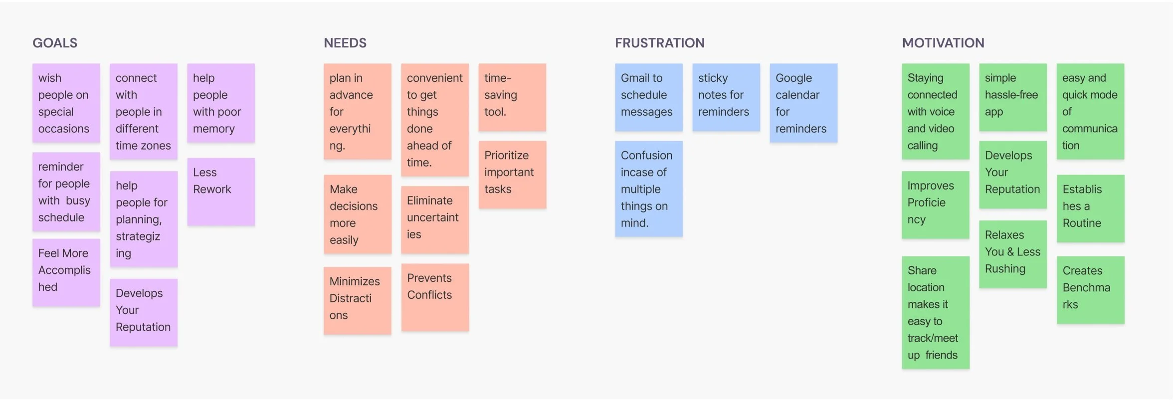
AFFINITY MAPPING
Affinity mapping allowed me to discover themes and common patterns within user feedback. It helped me organize their statements and gain insights from their commonalities.
DEFINE
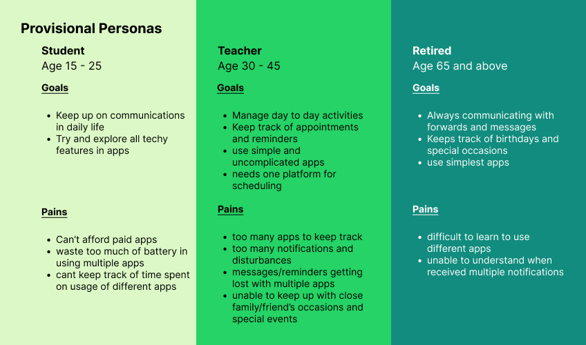
USER PERSONA
After researching, representing a major user group for the app helped me build the User Persona . It aided to express and focus on the needs and expectations of the most important user groups, giving a clear picture of how they're likely to use the feature of scheduling a message that I am going to add to the app.

MID FIDELITY WIREFRAMES
After settling on the design flow I designed the wireframes. It gave a better understanding of how my design will look and work. Mid-fidelity wireframes make evaluating the visual hierarchy on individual pages easier to see if the content structure works well. It helped me test the specific design elements of scheduling a message.
IDEATE
HI-FIDELITY
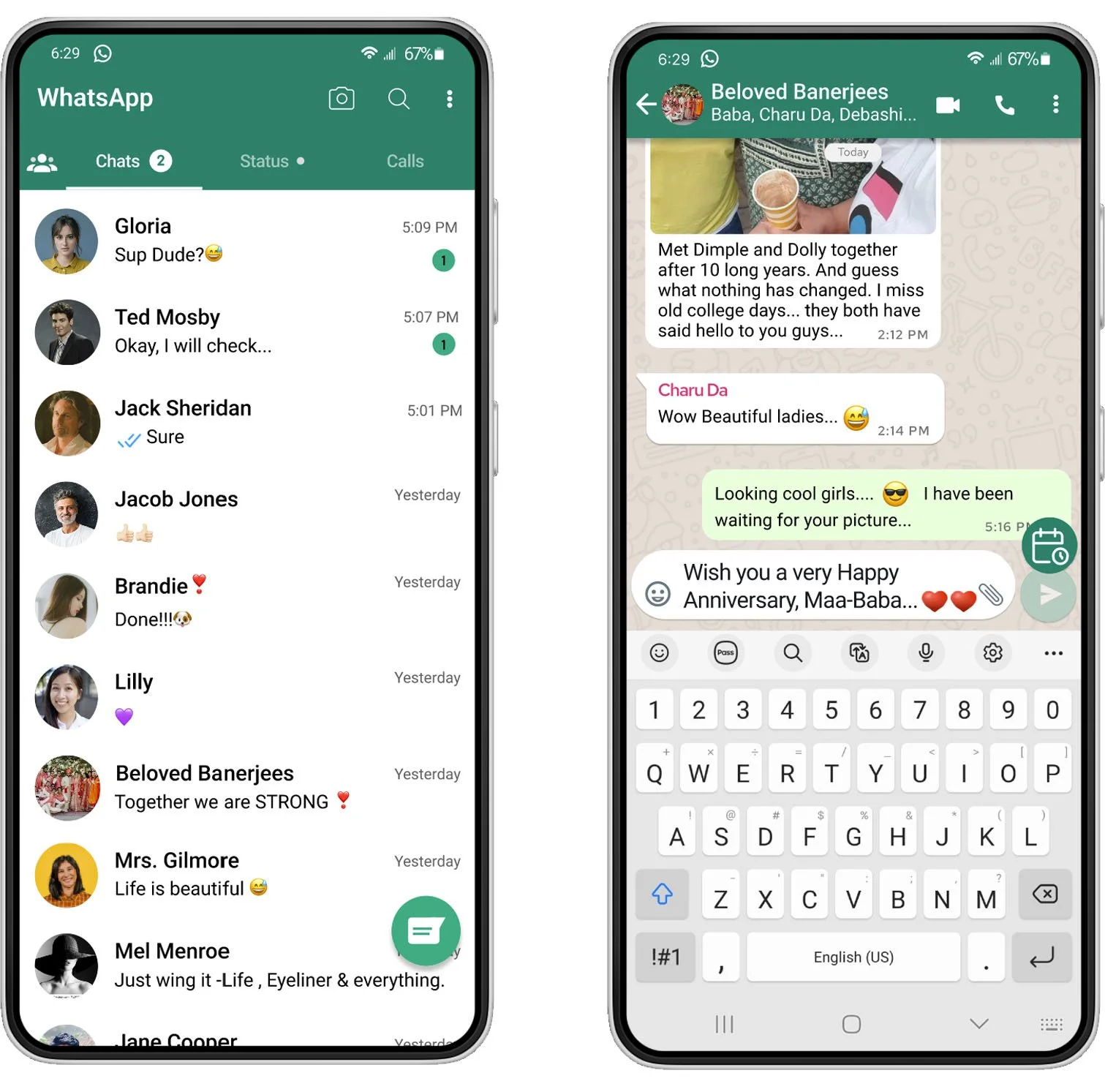
I designed the app feature that closely matches the final result of the app design. Presenting the content, visual styles, and transitions — all work together to make high fidelity assets look and work as close to the final design as possible.

UI KIT
I designed and compiled the set of files that contains critical UI components like fonts, layered design files, icons, that match the existing branding of WhatsApp! These elements built the UI of the app, a visualization of each component at any stage of user-interface contact. I used material UI design elements which would be consistent with different devices. It is a visual language that combines good design principles with technical and scientific innovation created to help teams build high-quality digital experiences for Android, iOS, Flutter, and the web.
PROTOTYPE
PROTOTYPE
Using the completed set of digital wireframes, I created a high-fidelity prototype.
TEST
USER TESTING
User testing is the focal point on testing the user interface of a the product to make sure everything functions as it should and users understand how to use the UI. It focuses on the overall experience of the user and how the product or website makes the user feel.
Test Objective
Determine the participant's satisfaction with the added flow of scheduling the message
Identify if any usability problems
Evaluate the ease of use of product
Identify any pain points and difficulties and work on what needs to be improved
AFFINITY MAPPING
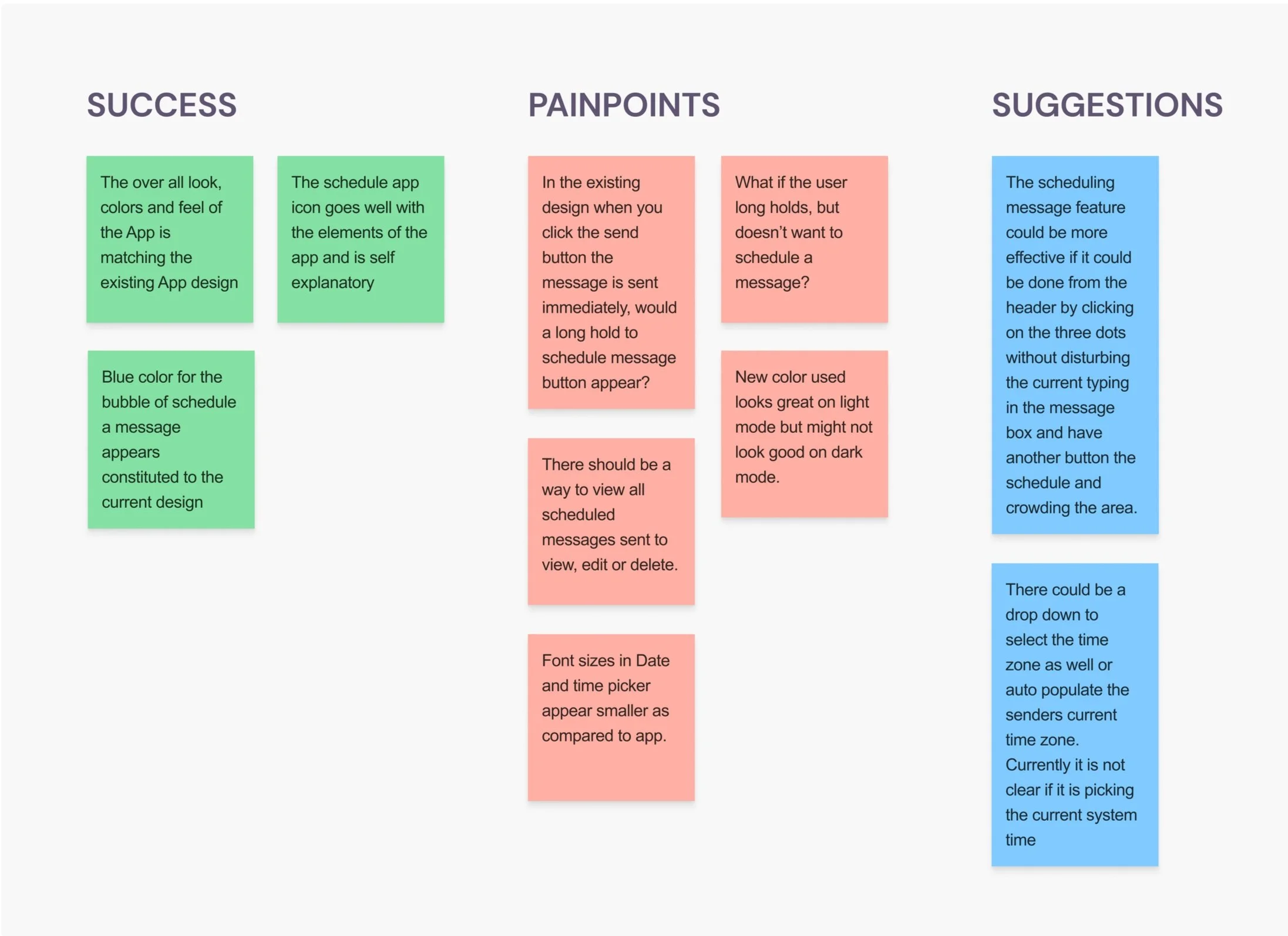
PRIORITY REVISIONS
The background color used for the scheduled message in light mode
The background color used for the scheduled message in dark mode
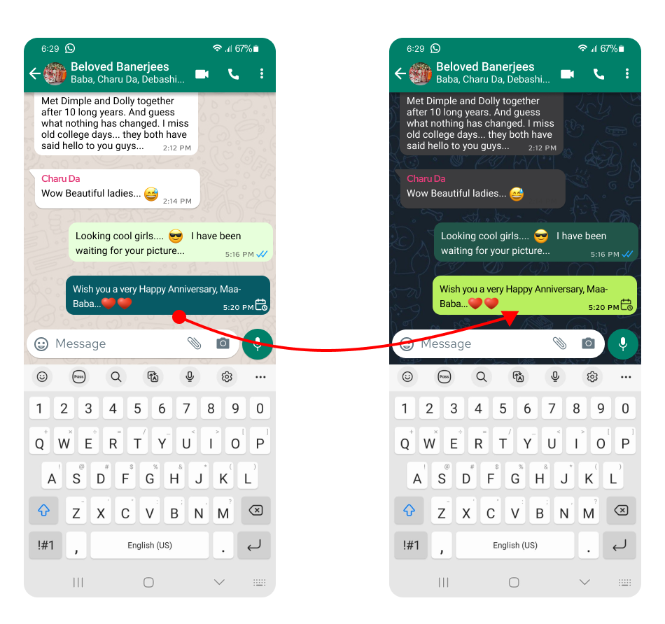
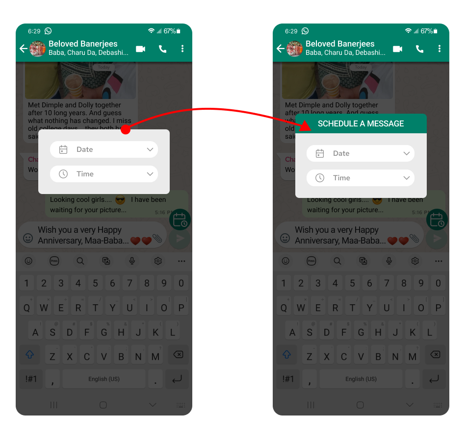
There was no title to date and time selection.
Added the title for the pop-up date and time selection.

Next Steps
The goal of this project was to add a feature of scheduling a message using Whatsapp! The feature allows to draft and schedule messages in advance by setting a date and time easily. It was an amazing experience considering the market research, it gave an opportunity to understand the costs associated with the competitors apps and how Whatsapp can do it for free. From the design prospective sticking to the existing brand was quite challenging.
I plan to add a page where the user can see all the scheduled messages sent to view and pending to edit.
Did I solve the problem?
I had a 100% completion rate and quotes from usability participants like...
IT LOOKS JUST LIKE WHATSAPP!
THE NEW COLOR USED GELS WITH THE CURRENT COLOR PALETTE.
THE IDEA OF ABLE TO SCHEDULE A MESSAGE SEEMS AWESOME AS WE ALWAYS FORGET WHEN WE ACTUALLY HAVE TO MESSAGE AND WHEN WE REMEBER IT IS EITHER TOO EARLY OR TOO LATE.
What I learned
I learned a lot about user prospective during my research. There are so many apps that support simple jobs/errands that we use day to day like reminders, alarms, trackers. All for which we give great importance, however human mind can only accommodate to a certain extent. The idea of able to do tasks before hand with a feature so simple and handy made a great learning.
What I would do differently
Next time I will...
- spend more time researching/user interviews
- draft the questions to empathy mapping
- design storyboards and user journeys
- use more of Figma features for designing