UX/UI Case Study
Adding donation flow to Charity App
Advika Welfare Foundation
Advika Welfare Foundation AWF is a non-profit organization providing higher education for destitute children from rural areas. They want you to help them design an intuitive, easy-to-use application that allows individuals and organizations to donate and volunteer easily and smoothly. Ease of service is key in the experience to ensure repeat use. The proposed application will help donors and volunteers —to donate to AWF in a timely, safe, and easy way.
Project Overview
Background
AWF is a small and growing non-profit based in Pune, Maharashtra, India dedicated to help indigent destitute children from rural areas. They have a residential facility, support and aid for higher education, and a guide for tertiary education. Their long-term plan is to nurture and grow more and more children. The duo Shripad and Shalaka Ghodke and their team have been heads down engineering the best possible scalable operation to connect and seek help for these budding flowers of tomorrow.
Problem
As they are continuously growing in this area and helping more children, it’s becoming challenging for them to track day to day operations manually. They need an app that allows donors and volunteers to easily connect and communicate with them.
Solution
An app can fulfill their needs and help the AWF automate and streamline their system. I offered to design a donation application that is user friendly and using which one can donate or volunteer. Transparency and visibility of the happenings is the aim to build the app and create a strong community platform.

01. Empathize
Understanding the market and users
MARKET RESEARCH
I started analyzing the market to get a better understanding on customer behavior. A market research will help to see if there are potential competitors and if there are what they offer and what they are lacking. Understand how my design will help differentiate the product in the heated competitive market.
Strengths
Easy to use
Automation options
Easy Navigation
Clean UI
Appealing illustrations
Weakness
Enhanced features are available are paid
Poor customer service
Strengths
Easy to Create & manage volunteer opportunities
Recruit volunteers from our corporate & API partners
Automatically send customized greetings to prospective volunteers
View and export report
Weakness
Enhanced features are available are paid
Poor customer service" to give more.
Strengths
user friendly and very easy to use.
Free and easy to sign up
cutting edge technology
easy to able to obtain reports
fantastic customer service.
easy set up reoccurring donations
Weakness
confusing to use
inability to go back in to correct or delete
transactions before finalizing it.
The app doesn't allow you to put in a single amount and then spread it by counting down to zero.
The user has to input an amount, select a specific category, and then click "add donation" to give more.
COMPETITIVE RESEARCH
There are many apps in the competition but none serves for one particular non-profit for obvious reasons that they can’t afford to design and develop one. I gathered data of the general competitors to help understand what brands are doing, and identifying the strengths and weaknesses. It was important to understand what users were having a hard time using these apps and to consider the same while I design.
The entire point of doing a competitive analysis was so that I can determine what makes a satisfying user experience and see what ways I was able to improve on it even more.
Summary
Most apps are free and easily accessible
Most apps have the ability to let one donate anonymously
All apps have a nice, and intuitive interface
Most apps need/ask to create an account in order to donate.
Most apps have recurring donations options.
All apps provide updates on the impact.
USER INTERVIEWS
I conducted interviews with about five participants online and one-on-one in person. I will hear their first time stories and gather in depth understanding of how they react to donating or volunteer and what they need and their concerns when accessing an app.
We want to explore the pain points that people have when they donate. What do they think about the process of donation and if they have any concerns? Understand what mode of donations they prefer.
Research Objectives
Determine the target audience
Understanding the means and ways people donate
Know the comfort and ease of donating in those different ways
Understand what they feel while and after donating
Determine the factors essential for donating
Understand the expectations of the users from non-profits
Affinity Mapping
After user interviews, documented the key findings to affinity Mapping. It helps to identify issues and insights, reveals thematic patterns, facilitates productive discussions and builds a shared understanding.

02. Define
Defining the problem
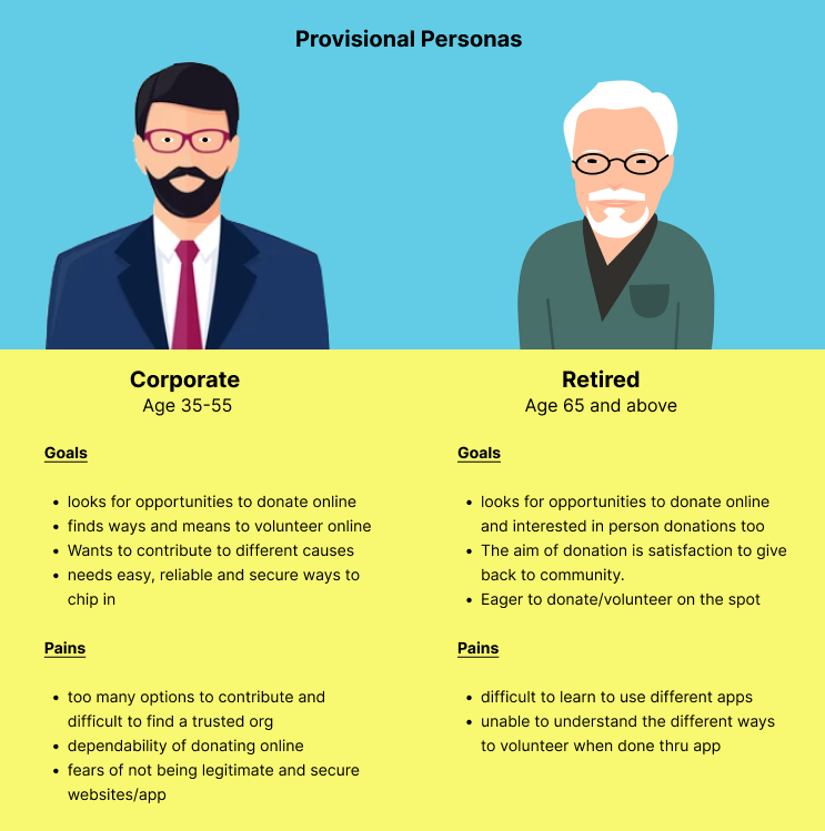
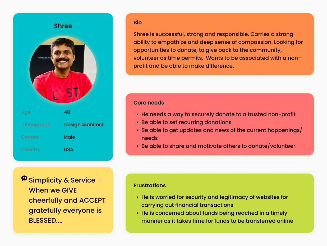
After organizing the gathered information from market research and user interviews, understanding the users' needs and problems and analyzing the observations I designed an User Persona. Being able to connect with your supporters through their personal mobile devices is probably the most powerful reasoning for creating a mobile app.
This helped me focus on a target demographic and design the mobile app. Considering that, I created persona "Shree Kabral" - this lets me hone in on my priorities, goals, and put a face to my users.
USER PERSONA
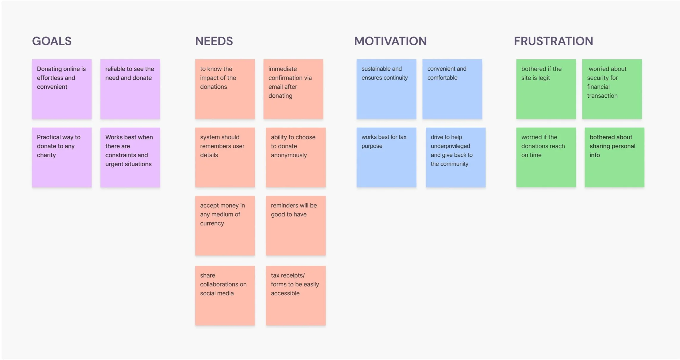
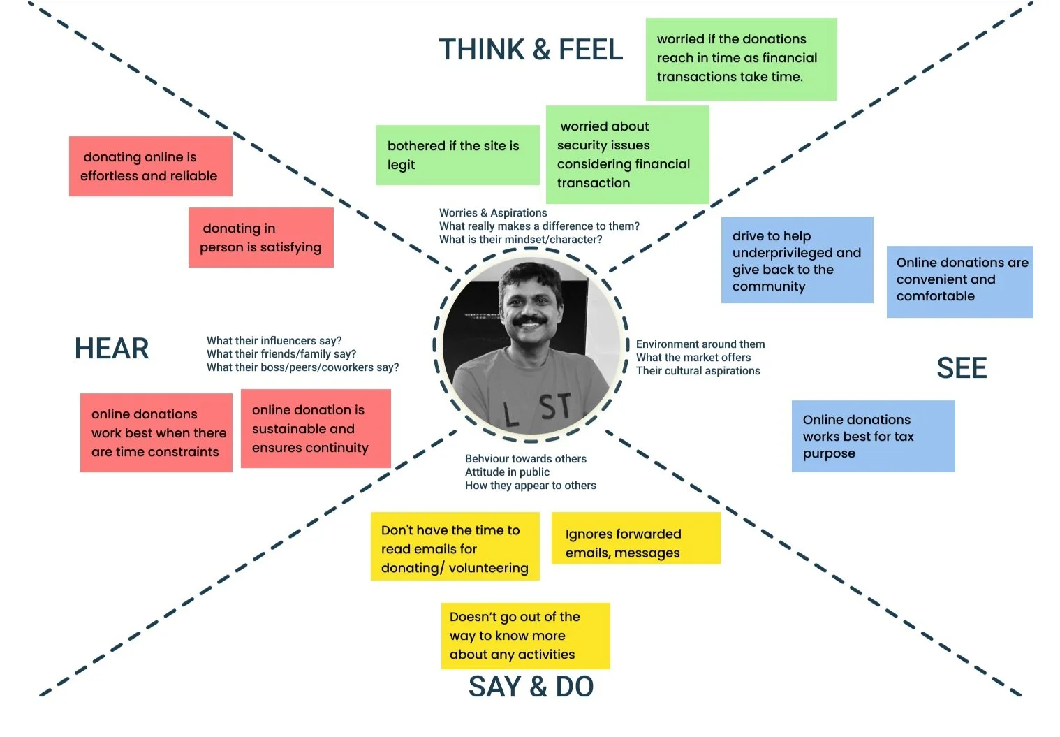
EMPATHY MAP
Designed the empathy map, a tool that can be used to gain a deeper insight into the user with the same observations and understanding from User interviews. Much like a user persona, an empathy map can represent a group of users.
SITEMAP
I started creating a sitemap to show how the screens are prioritized, linked, and labelled. It was important to put down a hierarchical diagram of the application before going in with the wireframes.
I took into consideration what users will see when they open the app right away, the navigation and information about the pages on the app, and the relationships between them. It was easy to streamline the number of screens and a good way to really hone in on what was the highest priority and would benefit my users the most.
As the project went on, I had to deviate from my plan of About and add that info to the landing page. I included What we do? Help us with - , Impact stories and We support. All this comprises about the Non-profit. As a designer, sometimes we have to make change decisions and this was one of them. To save time and prioritize my work, I made the professional decision to have lesser screens but more interactivity and experience over more screens and a not-so-great user experience.

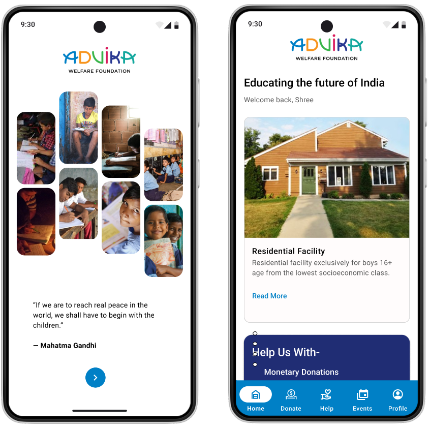
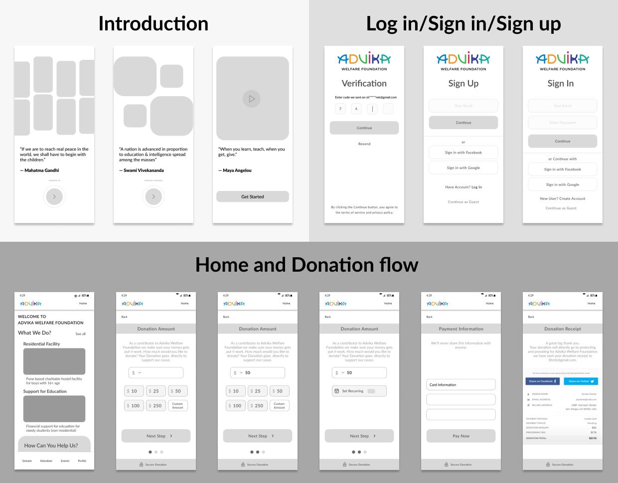
WIREFRAMES
With a few sketches done, I started digitizing my concepts using Figma and prioritized the most important pages.
Splash screen
Introduction screen
Log In/Sign In, Sign Up
Landing Page
Donate
Volunteer
Events
This came along a long way. Although it took me awhile to find self-explanatory icons for my app to give an appealing visual experience. It was important for me to include them as it would help with understanding the accessibility of app for any age group. I found icons in a plugin from Figma.
03. Ideate
Generating solutions to the problems
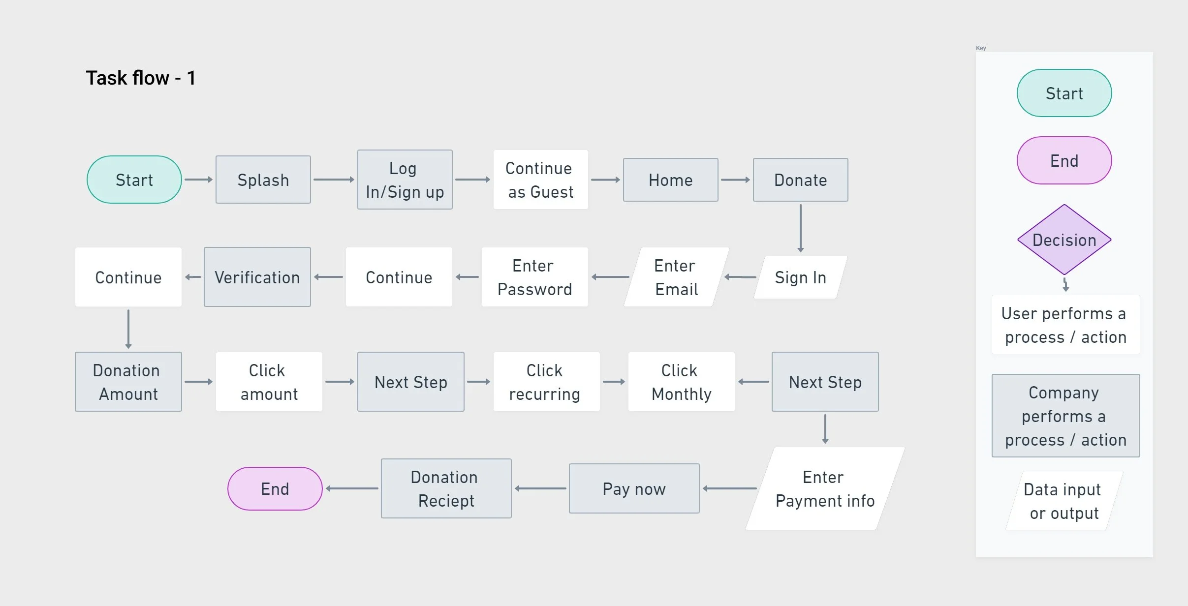
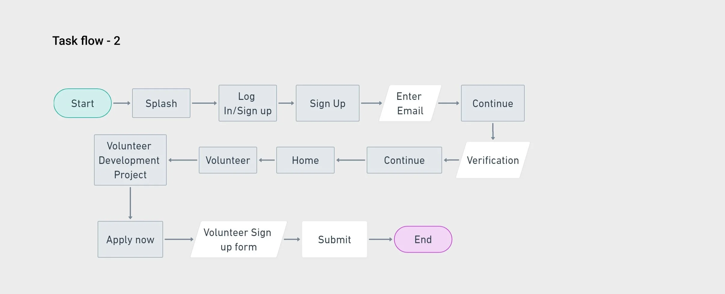
TASK FLOW
Further it enabled me to come up with a task flow to help represent a user’s journey through a specific task. Doing this helps me figure out what features were most important and helps me prioritize my goals. In this case, I focused on three flows.
Giving myself real-life scenarios that my users may go through helps me understand their thought process and decision-making skills better. In this case, I was trying to understand why my users needed certain features like Volunteer, Donating, checking the events, reading impact stories and so on. To include certain features, it is important as a designer to understand why its needed and how it would benefit my users.
What happens when a user wants to Donate money through the app?
How does a user find their way to volunteer?
How does the user view events?
USER FLOW
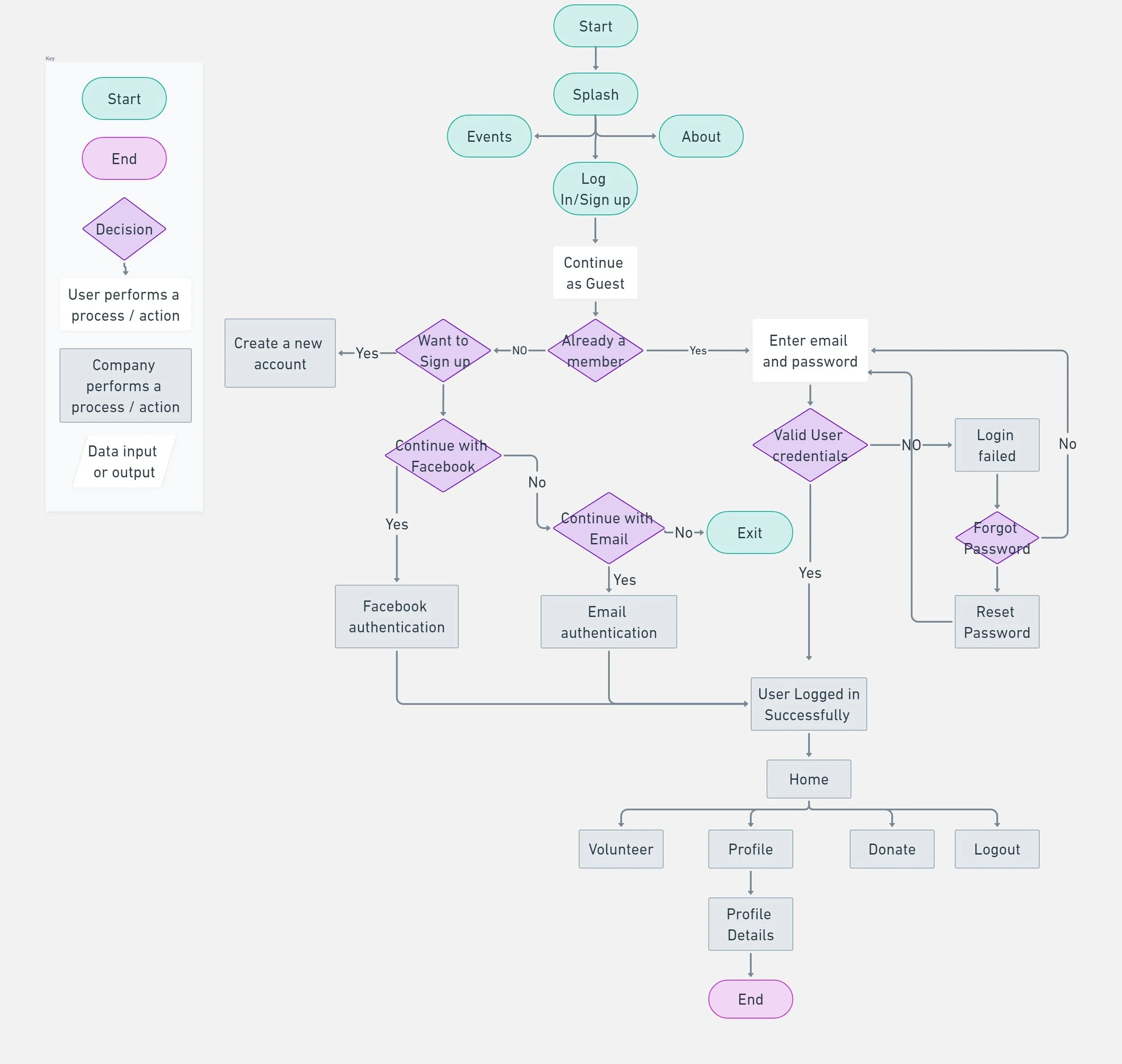
After defining the product, I created a user flow - a diagram that displays the complete path a user takes when using a product.
The user flow lays out the user’s movement through the product, mapping out each and every step the user takes - from entry point through to the final interaction. To do this, I created a user flow where user can manually click the navigation to access the page and perform the task.
Security being the utmost importance considering user’s financial information and that transactions will be done through the app.
I tried to get as detailed as I could with my user flow in order to fully understand what my app is able to accomplish and how it would help not only my users but the management as well.
I hoped to find out what features were most important and needed prioritization, how seamless onboarding would be, how easy it would be to navigate through the app.,
Shree wants to donate money and set a recurring amount for the same.
Shree wants to volunteer and woud fill a form along with his details and availability.
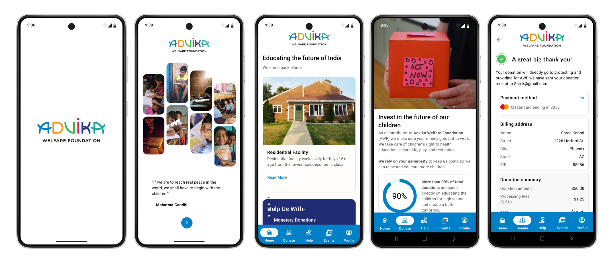
HI-FI DESIGN
Taking into consideration everything that I’ve done so far, I started designing high fidelity prototype of the design for the app screens.

UI Kit
I created reusable elements and components to make the design process more efficient and establish a more consistent experience all around.

04. Prototype
Bringing ideas and solutions to life
PROTOTYPE
Using the completed set of digital wireframes, I created a high-fidelity prototype. Based on the limited time and resources of this project, I chose to focus on three flows.
05. Test
Testing the solutions
USER TESTING
I did moderated testing, communicating directly with the participants to gain a better understanding of the user experience trying out the app prototype.
Test Objective
Test the overall satisfaction and ease of use
Observe how easily and efficiently users are able to perform certain tasks and understand their thought process while doing so
Identify any pain points and difficulties and work on what needs to be improved
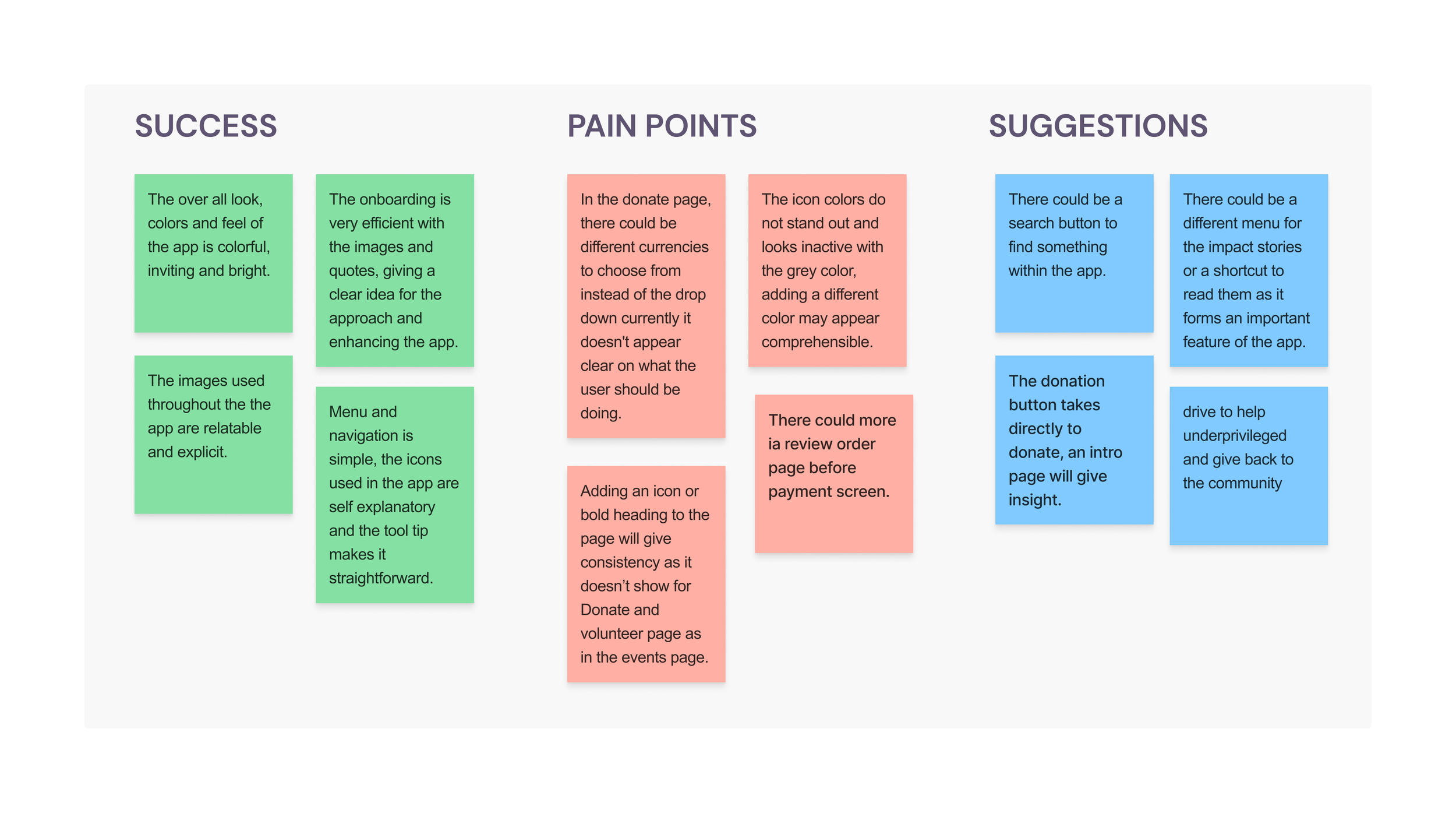
AFFINITY MAPPING
After gathering all the participants’ relevant feedback, I created an affinity map to synthesize the findings. By doing this, I was able to document the research findings and uncover the issues in my designs and help to determine on the prioritization for reiterations.
This went by a lot better than expected, and although there were a couple of pain points that my users had, it gave me so much motivation to make the app even better than before.
Summary of Findings
Search button could enhance the app incase the user is unable to find anything they are looking for
There could be individual button/page to access Impact Stories directly instead scrolling down in the landing page.
Users enjoyed the ample information that the non-profit offers and expects
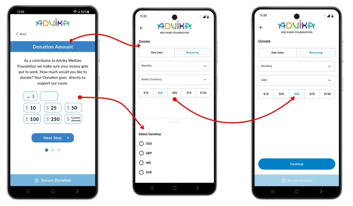
Users expected a clear visual for currency selection as against a drop down to see available options to donate
PRIORITY REVISIONS
After conducting the usability testing and gathering valuable insight from my users, I went back into Figma to start prioritizing screens to reiterate.
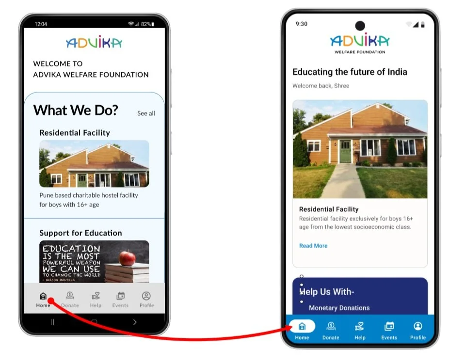
Give clear visual understanding to the user of being on the current page.
The grey background color for the navigation was not standing out and appeared inactive
The current page icon color didn’t appear obvious as well
Changed the grey background navigation color to blue
Changed current page icon color to white
Give more clarity to the user to select the currency for donating.
The heading of the page was not as same at the page name
The currency selection option of drop down appeared confusing.
Changed the heading of the page and aligned left
Changed it to currency options to choose from
After which the user can select the amount of donation

NEXT STEPS…
What I’ve learnt and what I would’ve done differently:
I would have invested more time to do relevant research digging deep to get more insight on the topic because most often we are surprised by our own findings.
More Patience
Always recognize assumptions that are being made, then question and clarify them with your audience, users, or target. You will be amazed at how much paradigm altering information you will uncover when you simply question assumptions.
Never Make Assumptions
Humans can only focus on one thing at a time, so prioritizing my actions and direct attention to the goal. Pick your battles wisely — be careful how you direct their attention because each move can distract their focus from your goal.
Human attention is finite